Graphic Design Basics

In this section you'll find a breif summary of some of the principles of Graphic Design such as color theory, font selection, and more. While it's certainly not as in depth as what you would learn in a semester long graphic design course, this information can act as a foundation for you when you're creating your custom design on any of our products.
If you have any other questions about what you see here, or would like a bit more information on a specific topic, don't hesitate to contact us! We're more than happy to be of assistance.
You can find additional help on our Design Tips page, or check out our How To Tutorials and our Design Tool Tips pages for ideas on creating your own custom design directly in our Design Tool.

Introduction
Graphic design is a process of communication in a visual format. Many professional designers will take written concepts and translate them into visual representations that communicate the same message as what was originally written.
Consider the concept of "Love" and what it means to you. A designer will likely chose shapes, colors and supporting text to help communicate what that means to them or their client. They might use a shape like a heart, words like "passion" and colors like red or pink. Because everyone has their own opinion, no two designs will communicate the exact same meaning or be interpreted the same by people who view the results. Use these Design Basics below to develop a strong foundation for each element that goes into design theory.
Color Theory
Color uses in a design can absolutely make or break your message. When implemented the right way, different colors can absolutely bring your design to life and make it easier for your audience to understand what you're trying to communicate. Important elements to consider are your color hues, tones and how well they work together in your design. For example, let's say you've chosen a dark blue for your background color. You would want to use a lighter or brighter color as a point of contrast for any images or text you add to your design. Using another dark color, like black or dark green, will be much harder to read at a distance since there isn't much color or tone contrast between them. Ideally, you'd want to use a color like white, light yellow or orange, or even lighter colors from the same family like a very light blue.
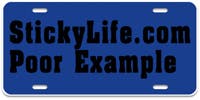 Low Contrast colors are harder to read
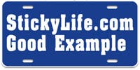 High Contrast colors help your message stand out
See our list of available colors for all color options.
The use of color is a highly studied science. Colors imply a feeling and emotional tone, which you can use to emphasize your message in your design. For example, the color red is commonly associated with passion, anger, danger, hunger, or horror; green is often linked with nature, renewal, and energy; blue usually means relaxation, calmness, and so on. If your message was about peace and happiness, you wouldn't necessarily want to pick darker colors for your design but rather lighter, brighter colors. Color selection is important and should be taken seriously when creating your design.
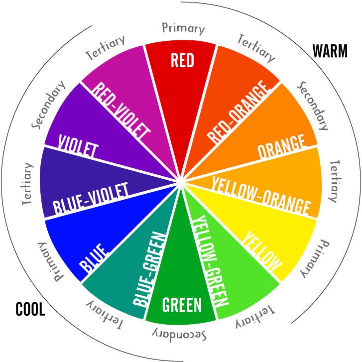
Color theory revolves around three basic components: The Color Wheel, Color Harmony, and Color Emotion.
The color wheel is an organization of colors based on their relationships. Red, Yellow, and Blue are called primary colors, while Orange, Green and Violet make up the secondary colors. Secondary colors are made by combining equal parts of two Primary Colors (example: Red and Yellow are used to make Orange, etc). The third color category are the Tertiary Colors, which are a combination of primary colors and secondary colors. This graphic gives a visual of how the basic Color Wheel works.
Color harmony refers to how colors work together visually. There are three main types of Color Harmony: Analogous, Complementary and Monochromatic.
TIP: Nature produces natural color combinations that work well together. When in doubt, look out (of the window that is) for great inspiration for your color usage in your designs.
Analogous Colors:


You'll notice the letter A seems to look different in each color block. They're all the same red color in all four examples, but the way they appear to the eye changes depending on the background color. The most legible versions of each letter are the colors with the highest contrast.
Colors can have both a positive and a negative connotation. The colors you use in your design all have emotional connections that often derive from nature, so it's important you use the right colors to get your message across quickly and easily.
Pinks = acceptance, calmness, contentment, femininity, friendship, love, relaxation, romance, passiveness, weakness, embarrassment
Browns = earthy, masculinity, natural, solid, stability, wholesome, dirty, old, unclean
Oranges = action, creativity, curiosity, comical, desire, domination, pleasure, sexual passion, warming, aggression, deceit, distrust
Yellows = awareness, clarity, creative, energetic, freshness, intellect, jealousy, joy, pureness, caution, cowardice, fear
Greens = ambition, advancement, balance, natural, fertility, freedom, growth, life, protection, restful, greed, jealousy, poison, hazardous, chemical
Blues = calmness, cooling, inspiration, health, healing, knowledge, seriousness, softness, tranquility, sadness, depression, unhappiness
Purples = imagination, romance, royalty, richness, powerful, supernatural, spooky, scary, gloom
White = angelic, beginning, cleanliness, goodness, innocence, light, perfection, positivity, purity, simplicity, sterility, virginity, naivety, emotionless
Black = authority, elegance, formality, mystery, power, prestige, strength, unknown, death, evil, fear, grief, negativity, impurity
K.I.S.S.
Keep It Simple Silly! When in doubt, subtract as much as possible. If it doesn't carry a high importance to your message - consider removing it. The basic principle of the KISS philosophy is to not over-work something. Sometimes less is more.
Hierarchy
Hierarchy refers to the order of content and elements in a design such as text, images, illustrations, patterns, and so on. You want to consider the importance of every element in your design, then organize them based on importance. What do you want people to see and know first? What should be noticed next? The most important elements in your design should carry the most weight and be noticed first. You can organize your content through text weight, size, color relationships, placement and more.
Ultimately, you want to guide people viewing your design so that they digest the information in order of importance. In the end you will develop a design that is both memorable and attractive.
Balanced Designs
A well balanced design is important to ensuring your message is easy to understand. Without balance, your design will feel uneasy, tense, and disorganized, and can be hard for your audience to follow. Balance can be as formal as a symmetrical formation to something more casual through asymmetrical formation.
Symmetrical balance is similar to what you see in a mirror. Your face is, for the most part, symmetrical; you have two eyes, two ears and one nose.A balanced design can be easily split the same way. If you were to draw a line down the center of your design, both halves would be equal in regards to text placement, imagery, and alignment. Symmetrical balance is generally used in more formal settings, like wedding invitations and important announcements.
Asymmetrical balance can be a bit harder to master. You can balance two elements without making them look the exact same through your use of color, shape, size, contrast, placement and more. Think of the way we read, from top left to bottom right, almost as if on a diagonal axis. A design set up to follow the natural path our eyes take while reading could be considered to have an asymmetrical balance. Asymmetrical balance tends to have a relax feel and is intended to be read quickly, like a newspaper or magazine.
Some designers refer to a third form of balance called Radial Symmetry. We like to think of it as balance through central perspective. With radial symmetry the focal point starts in the middle of the design and works its way outward, similar to the pattern on a bulls eye target. Designs that feature curved text around an image, logo, or graphic are thought of as having Radial Symmetry.
Negative or White Space
Don't be afraid of white space, or negative space. You can use it to your advantage to help highlight important aspects of your design. White space, or negative space, refers to the areas in your design that contain no text or graphics (not including background textures, colors, or designs), and is a strong visual hierarchy tool. White space can be used to direct the viewer's eye towards the parts of your design you consider to be most important. Some may feel these empty areas should be filled with additional information, though often if you fill every empty space it detracts from what you really want viewers to see and acts to clutter your message.
Font Selection
Selecting a font for your design is incredibly important in getting your message across correctly. Font styles, just like colors, can evoke different feelings and emotions so choosing the right font can make or break your design. The three biggest factors you'll want to consider when selecting your font are the font family, font style, and font weight.
Font FamilyFont family can refer to one of two things: the Generic Family and the Family Name.
A font's Generic Family is the basic structure of the font design itself. There are five main defined Generic Font Family types: Serif (like Times New Roman), Sans Serif (like Arial), Cursive or Script (like Brush Script), Fantasy or Decorative (like Wingdings Western), and Monospace (like Courier).
A font's Family Name refers to the actual overall name of the font itself. For example, the font you're seeing right now is called Arial, which has several sub-categories like Arial Black, Arial Narrow, Arial Rounded, Arial Light, and more depending on the font distributor.
Each font family has its own distinct style and can change the way your message comes across in your design. Serif fonts are generally thought to be professional or reserved, whereas Cursive fonts can make your design feel formal or fancy. You wouldn't use a font like Comic Sans to design a wedding invitation or a resume, just like you wouldn't use a font like Andale Mono to design a poster for a Halloween party. Using the right font to relay your message can be just as important as the message itself, and using a font that gives a different feeling than what you're trying to say can change the meaning of your design drastically.
You can find a full list of our available fonts here.
Font StyleFont style refers to how each font type is presented in your design. There are five common font styles used in graphic design and typography: Regular, Bold, Italic, Underline, and Strike Through.
Font styles are generally used to emphasize different parts of your text in your design. Bold text is often used to denote a header topic on a paragraph (like the 'Font Style' text above), Italic text can be used to highlight important words or phrases, and so on. You can test out how each style can impact your message by using them in your design and reading them out loud to yourself. "I don't really want to do the work today." feels a lot different from "I don't really want to do the work today."
Font WeightFont weight refers to the thickness or thinness of a font. A heavier font weight will usually include thicker, sturdier shaped letterforms, while a lighter font weight will have thinner letterforms. A font like Impact would be considered a heavy weight font, for example, and a font like Times New Roman would be considered a medium weight font.
Heavier weighted fonts are much easier to read at further distances. If you're intending your design to be seen from a far distance (like a door magnet on a work truck or vinyl lettering for a storefront window), you might want to consider using a heavier weight font to help people read the information easier as they're walking or driving by. Designs that are meant to be viewed at a closer distance, like a small decal for a water bottle, tend to be easier to read if you use a lighter weight font.
Don't be afraid of big bold text. Experiment with your font selection and font styles to find something that doesn't just work great for your message but also looks great for your intended audience as well. Sometimes your text itself can be just as artistic as an illustration or photograph.
Additional Things to Consider
Always check your spelling, whether you use a Spell Checker or have someone do it for you. Correct spelling, punctuation, and grammar can make or break a design just as much as your color and font choices. For example, a common mistake people make is using quotation marks to emphasize a word or phrase they feel is important rather than using a font style. The end result typically gives their message the opposite meaning than they originally intended, almost as if they're being sarcastic instead of sincere. A tagline that reads Customer Satisfaction "Guaranteed" has a much different meaning than one that reads Customer Satisfaction Guaranteed.
Product SizeCreate your design for the actual final size of your product rather than the size you see on screen. What you see on screen may be larger or smaller than the actual size of your finished piece itself. It may help to cut out a piece of paper at the final dimensions of your product to use as a visual of how much space you have to work with when setting up your design. A full paragraph of text in a 3 x 6" oval space might look great on screen where it displays at a larger size, but once you have it in hand you may find it's impossible to read.
Do your homework and create a rough mockup of what you're wanting to make before starting your design. It doesn't have to be pretty; a rough sketch will work just as well as a full rendering. Try cutting out a piece of paper in the same size and shape you're thinking about ordering and using that as a base. This will give you a more accurate idea of how much area you have to work with, as well as what your limitations may be in terms of spacing and placement. You might even want to tape your sketch to the area where you want to use your design and view it at a distance to get a feel for how your final product will look once you've applied it so you'll know if you need to make any adjustments before submitting your order.

If you are using a product with a predefined shape, be aware that anything outside of that shape will be cut off in your final design. If you're uploading your own graphic and attempting to have full coverage, make sure your artwork is either the exact size you want your final product to be or slightly larger so you have a little wiggle room to make sure your design fully covers the entire space. A quarter inch of extra margins on each side is generally ideal for a full bleed. If you don't want to have a full bleed on your design, you'll want to leave at least a quarter inch margin area between the edge of your product shape and artwork.

If you can't find what you're looking for or aren't able to do it yourself through our design tool, you may need to hire a graphic designer. Sometimes what you have envisioned will only be possible through the help of someone with professional design training who can work with you to bring your vision to life. Once your graphic designer has created the final design that fits your needs, you'll be able to upload that file through our design tools. We generally suggest using a high resolution vector PDF file saved from the original program used to initially create the design, with all fonts converted to outlines and the artboard fit to the artwork itself with no empty margins around the sides. This will give you the best quality print for your design.